Loading cart contents...

Chicago History Museum Identity
Branding Explorations
This personal project re-imagines the Chicago History Museum’s (CHM) branding.
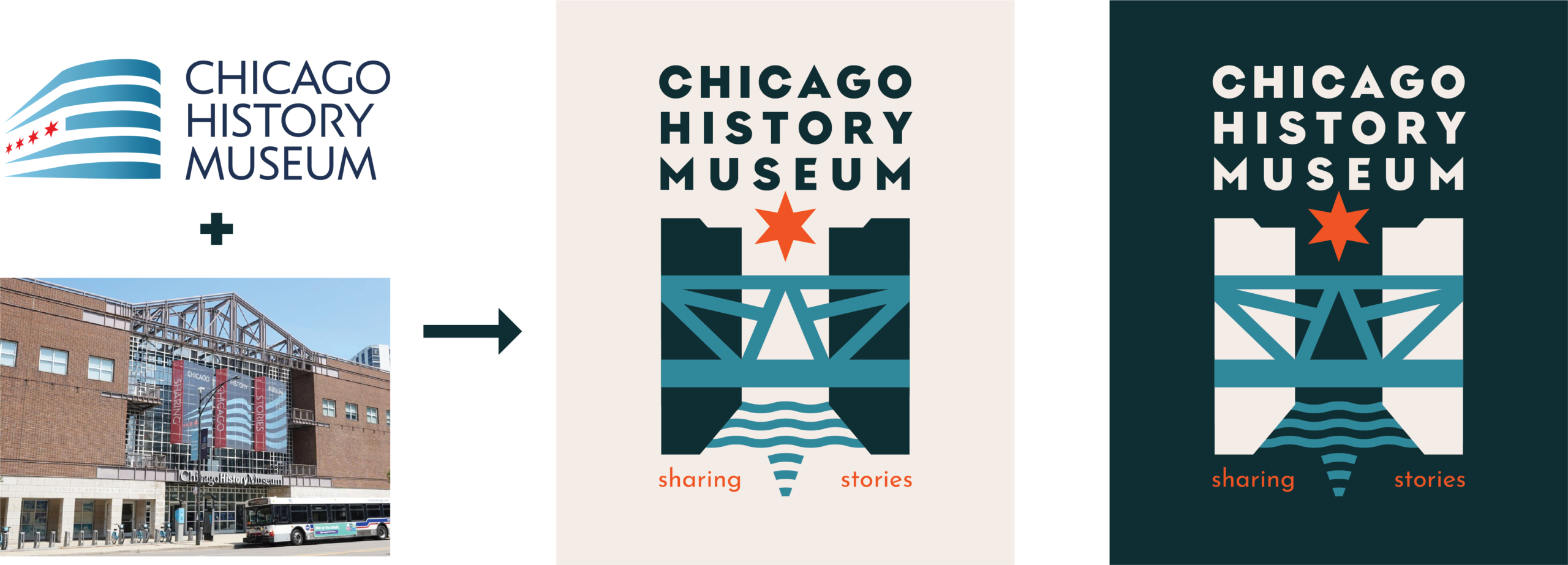
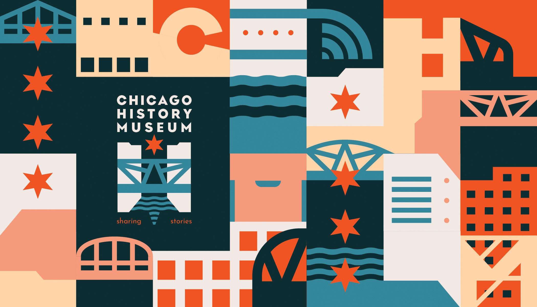
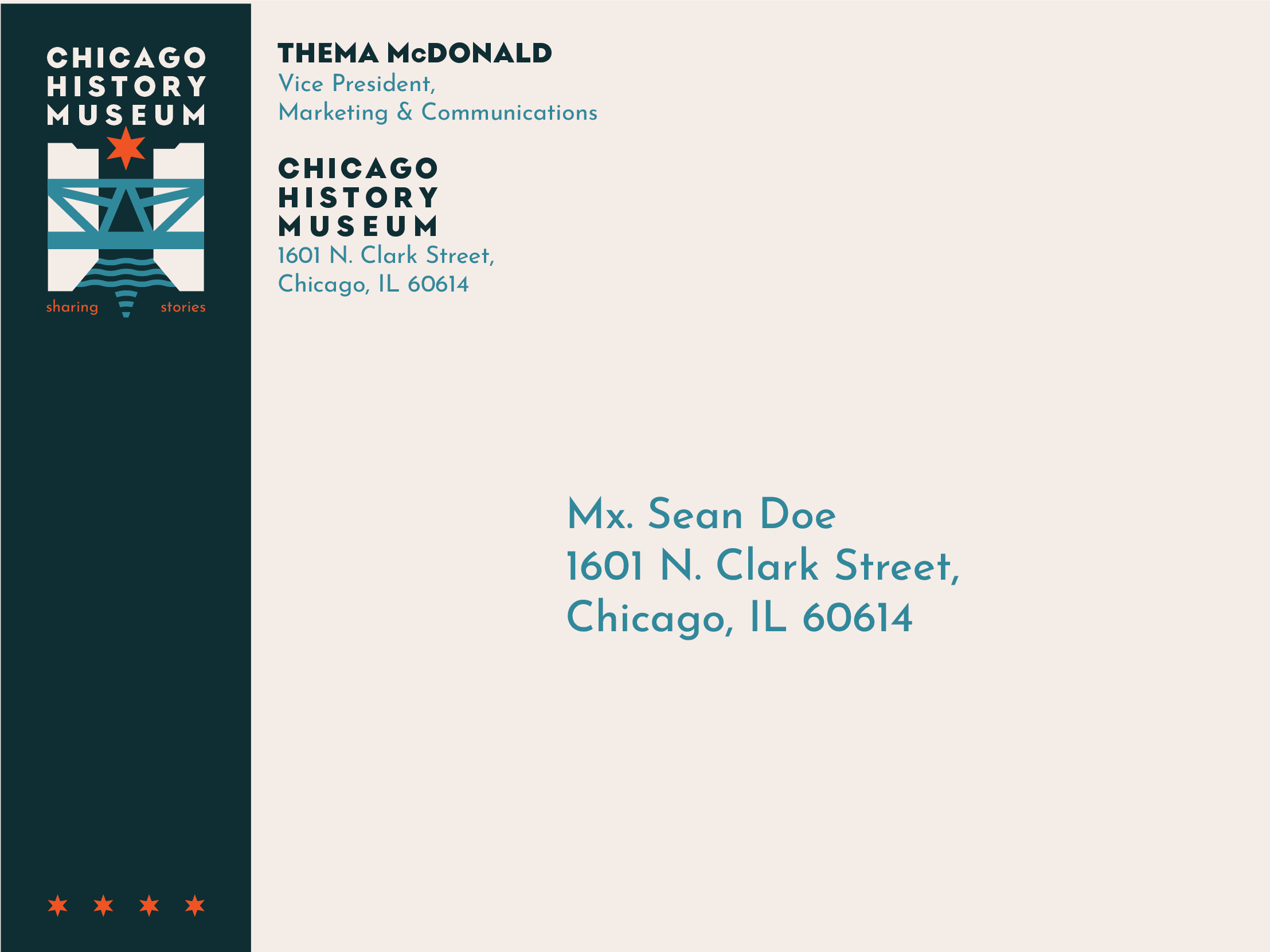
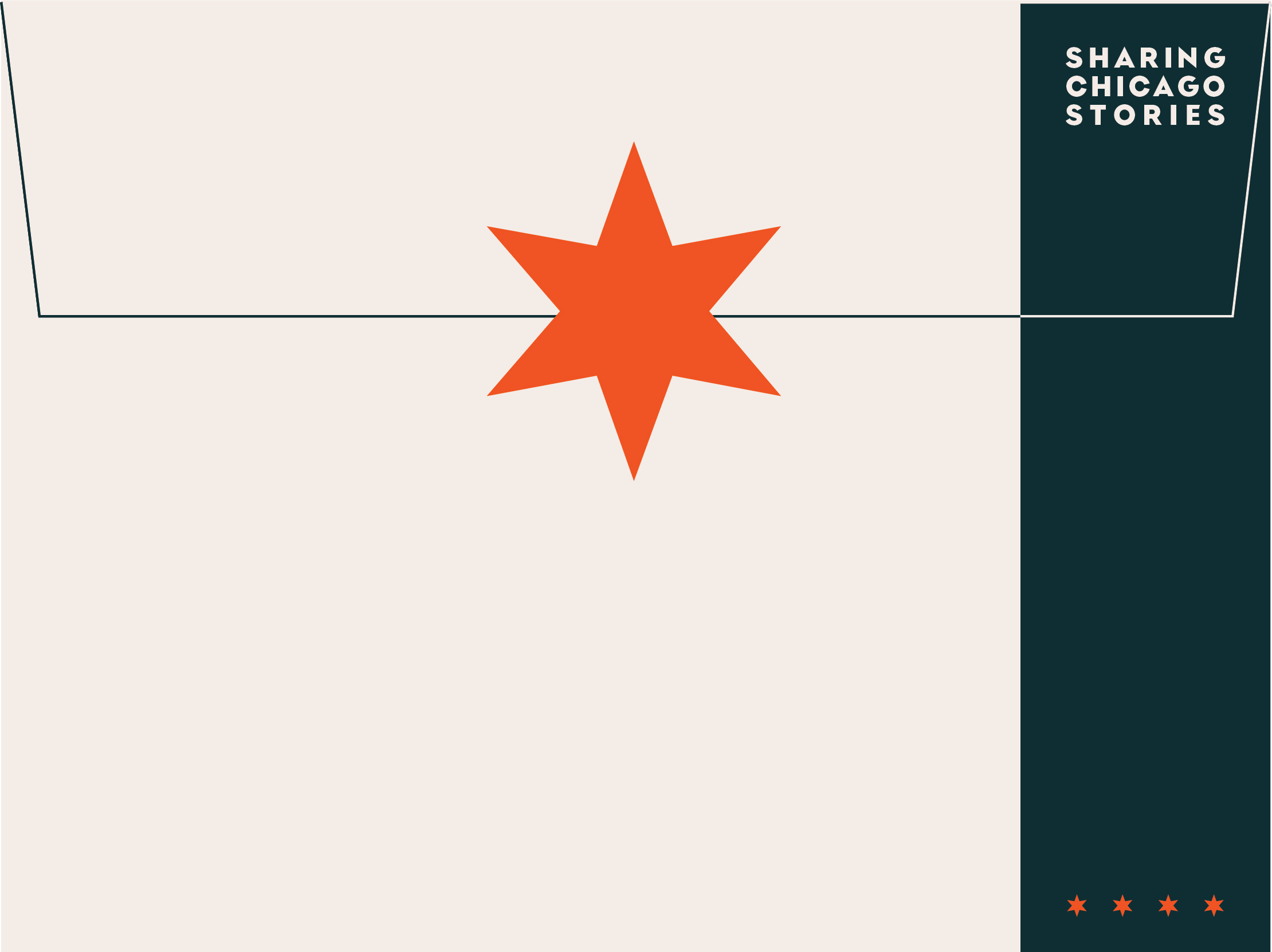
The proposed logo-mark brings together Chicago’s rivers, bridges, architecture, and iconic six-sided stars to build from the Museum’s current identity (building + flag) and self presentation (of so many exciting artifacts and conversations). A post-modern palette – a warm tomato red, dusty blue & navy, manila, salmon – lends itself to energetic, full-color posters as well as legible, dual-color designs.
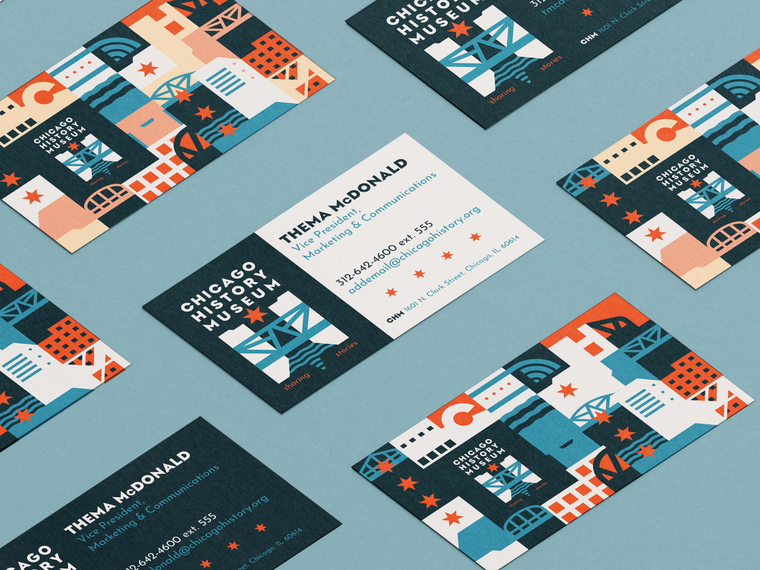
A playful, geometric, grid system – in homage to Chicago’s grid – expands the vocabulary of the logo on business cards, posters, and postcards. Manipulation of the grid – different scales, clustered clipping-masks, icons, & alternate geographies – gives the system adaptability, dynamic compositions, and animation potential, while foregrounding the Museum’s ‘bridging’ and connection of Chicago cultures and histories.
Deliverables
- Final logo with lockups
- + sketches, 3 alternate directions & revision
- Museum Brochure
- + 3 layout directions, wip
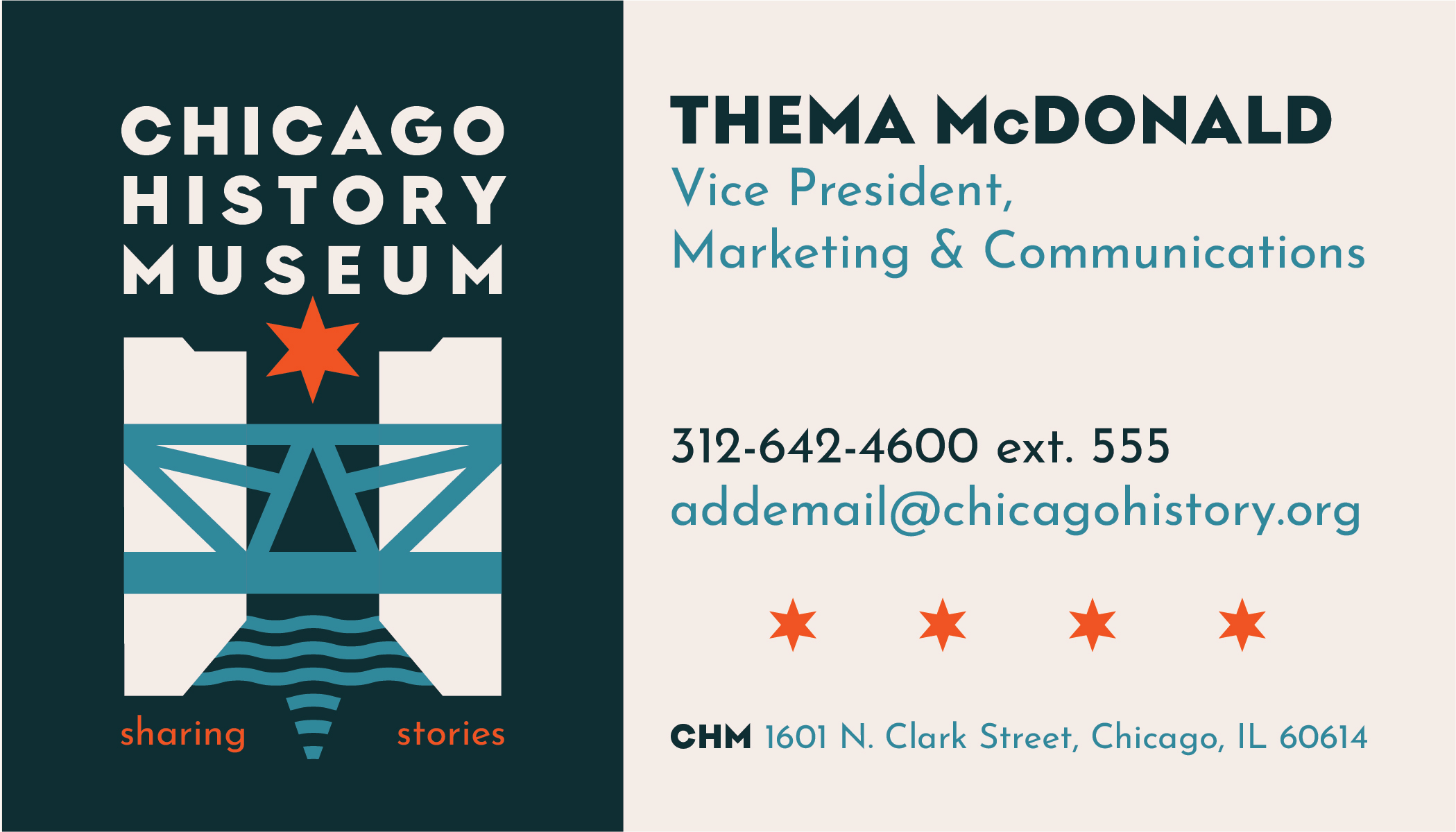
- Business Cards & Stationary in alternate colorways
- + 3 pattern directions & revisions
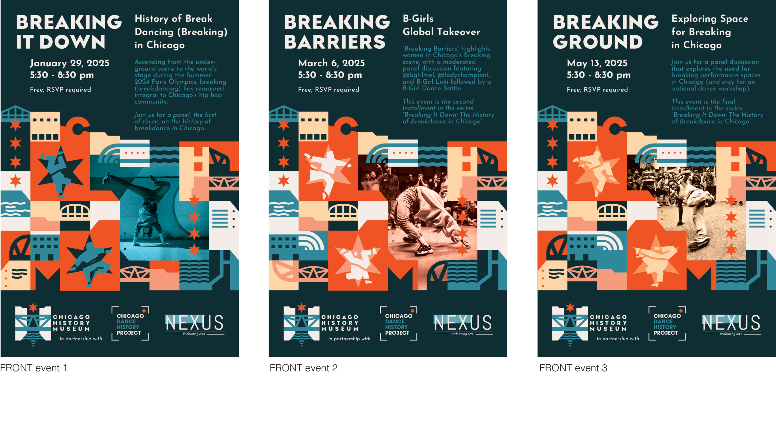
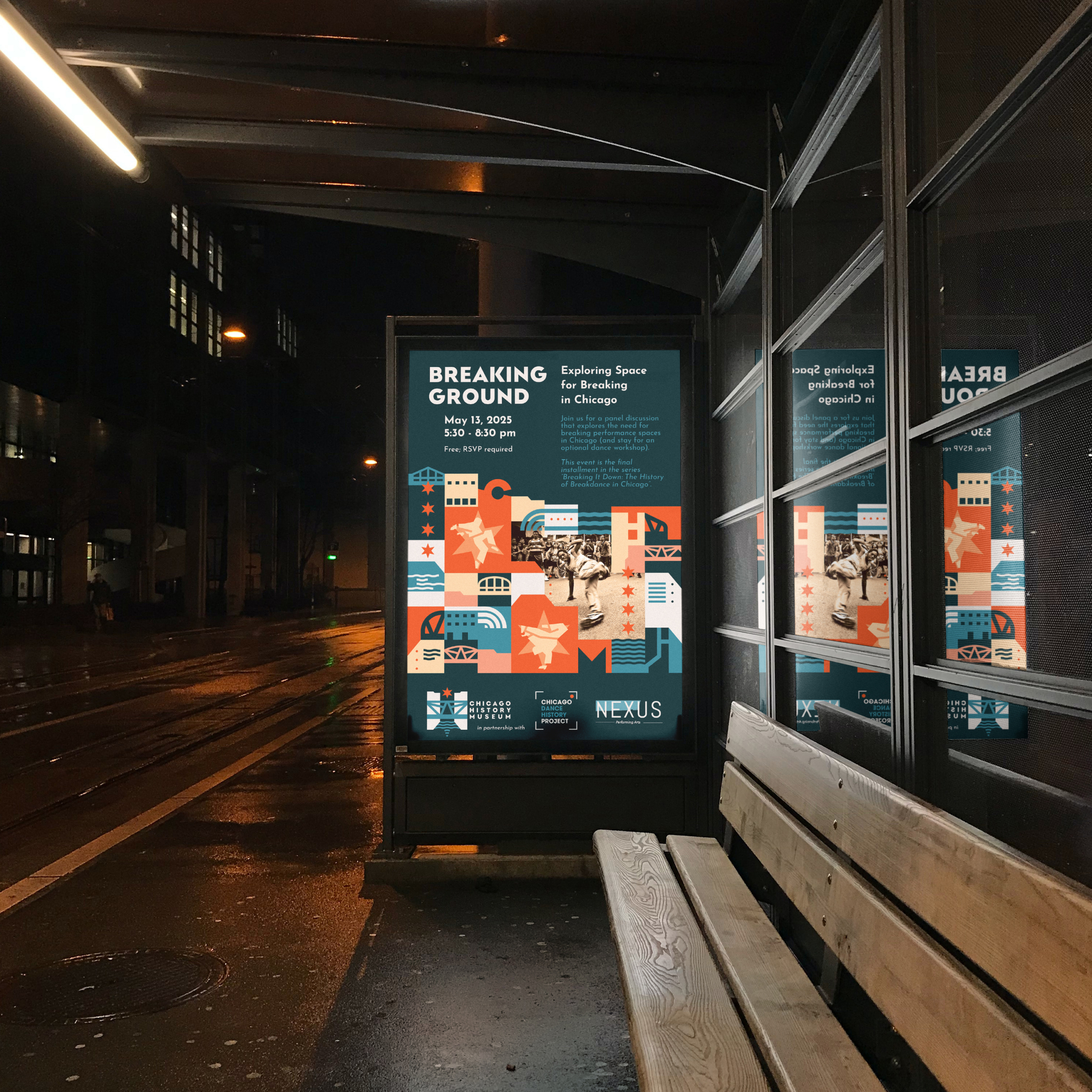
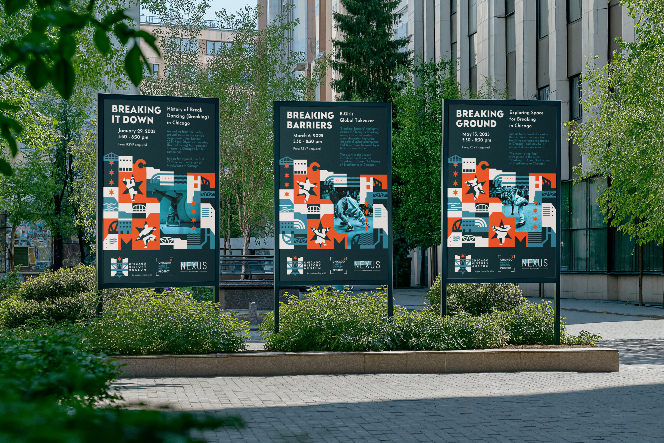
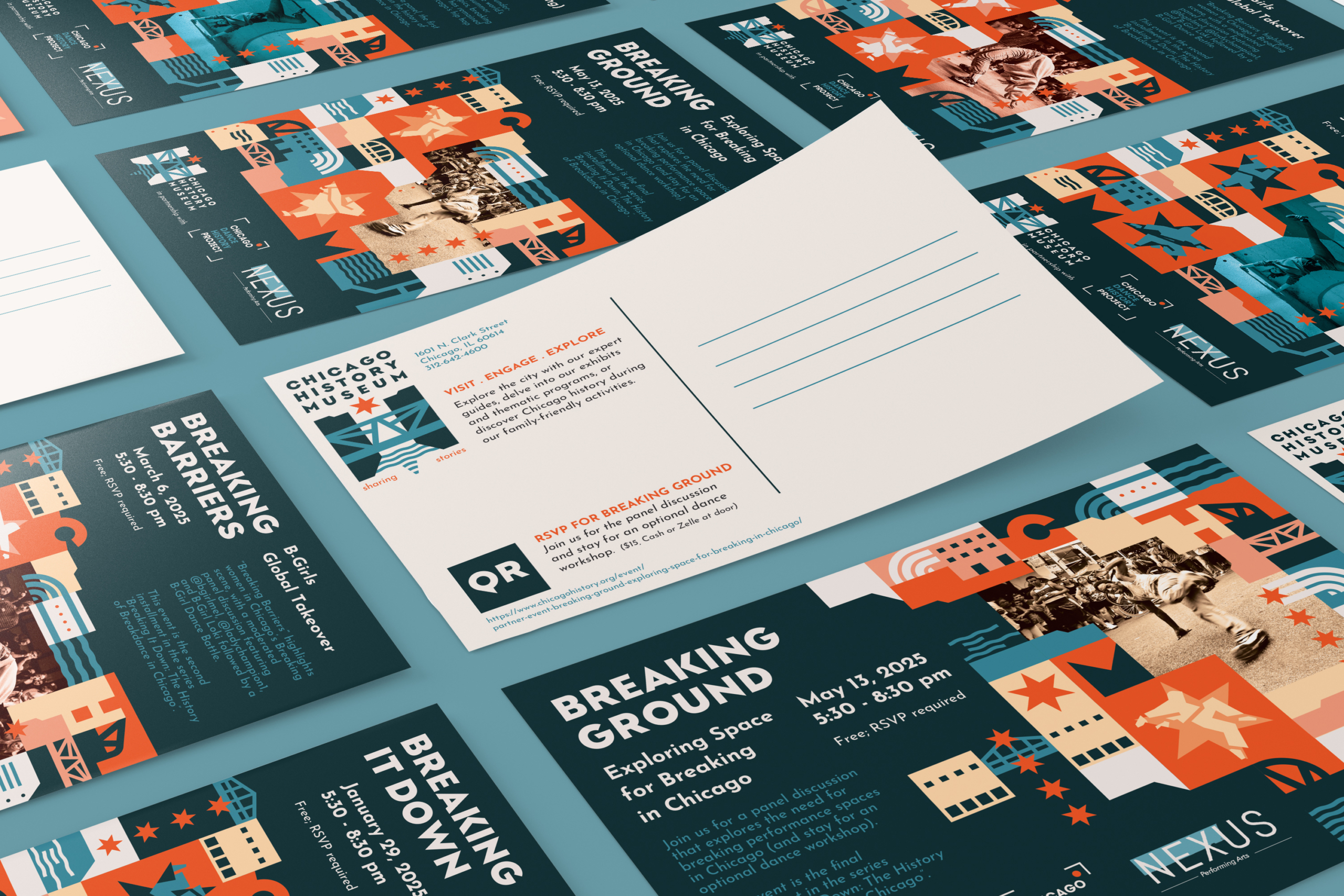
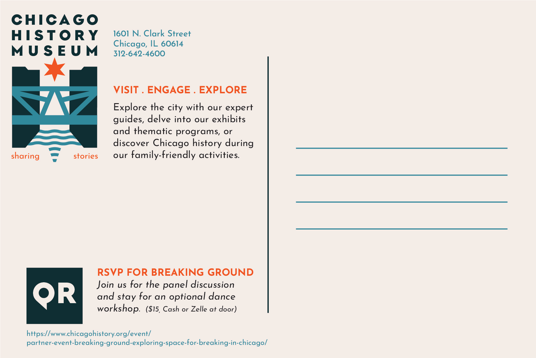
- Event Postcard/Poster
- + vertical/horizontal layouts & series/colorways
- + custom event icons (breakdancers)
- + 2 initial sketch directions
Client
- personal project
- + done for a SAIC course
- + feedback & guidance from Reisling Dong
existing > re-imagined logo
business cards & stationary
basic ‘city grid’ pattern . 1 scale + color options
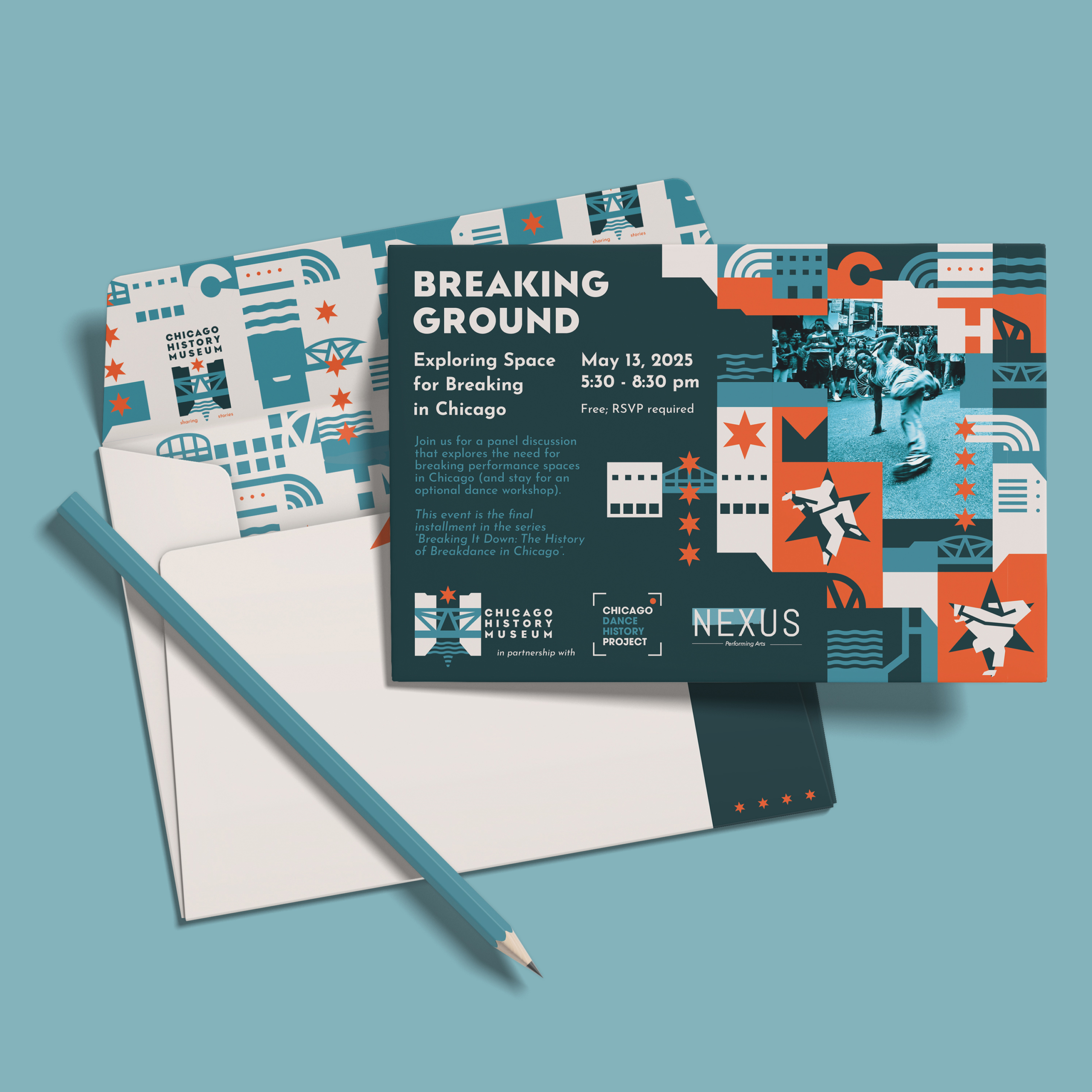
Event Posters & Postcards
Extended ‘city grid’ pattern . 2 scales + event icons + photos + color options

limited color version
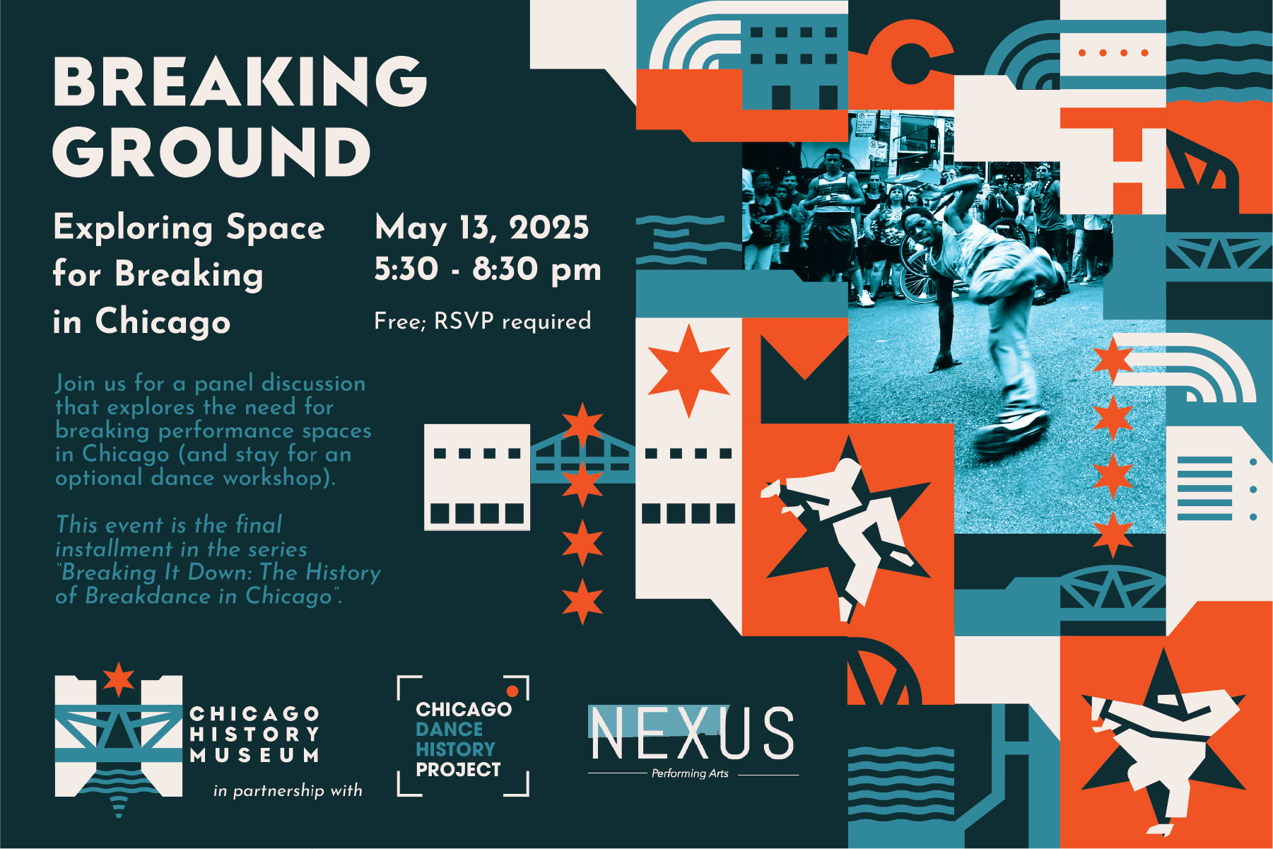
full color series